Wednesday 27 November 2013

Filming Schedule

Monday 18th November 2013

  • Test the attachment of camera inside the car
  • Try out the logistics of people being seen in the car
  • See how it would work with people gradually leaving the car
  • Get performers into the song, learning lyrics and adapting their performance to the track
  • Source all equipment required for the band performance
  • review footage afterwards to assess, camera steadiness and how well it incorporates the band in the car
Sunday 24th November 2014

  • Film all 3 band members in the car performing
  • Film 2 band members in the car performing
  • Film 1 band member in the car performing
  • Film empty car
  • Film all 3 members in band performing
  • Film drummer and one guitarist in band performing
  • Film just the drummer  in band performing
  • Film setting up of band performing to add authenticity in the video

Music Video Inspirations


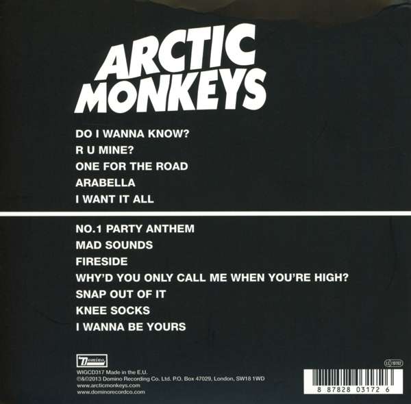
The first video I took inspiration was the Arctic Monkeys 'R U Mine'. I enjoyed watching this video and thought the mix between performance within the car and the more conventional band performance was a good combination. However such a video was achieved by Arctic Monkeys because Alex Turner is a highly talented performer, therefore replicating such good levels of performance would be difficult. As a result I decided to add a different dimension to my video, with a stop-motion element. Unlike in 'R U Mine' where both band members leave the car together, I chose to have my artists leaving the car at separate intervals, before subsequently appearing in the band performance. I felt this would detract from the fact they aren't professional performers and make the video interesting to watch, whereas with 'R U MINE' people will enjoy the video based on the Arctic Monkeys involvement solely. Moreover when editing the video I chose to convert my footage from within the car into black and white. This wasn't originally the plan, despite it working so well in 'R U Mine'. However it was difficult to light the car and putting the footage into black and white made it less glary, appearing more natural and authentic. Nonetheless I stuck with colour on the band performance footage, as I felt it looked more appropriate and showed clear differentiation between the two separate locations. Whilst the change in colour also provided the video with an additional element and this would keep it more interesting than if it was all in black and white. I felt this was essential as regardless of the song people will stop watching if the video is not interesting.

Furthermore the text at the start I felt would not only fill some of the time whilst the instrumental was playing (which could otherwise become boring if you weren't a massive fan of the song), but with it being a new artist would identify them quickly. Moreover I used the same font on this text as on my Digipak and Advert to continue this continuity and enhance 'Lost Planets' Identity.

Finally the transitions between these pieces of texts was similar to the transitions used on Kodaline's video for 'Love Like This'. The slide/wipe worked well because it was not too abrupt but clearly highlighted the change in text, enabling the audience to not be able to miss any information.

Wednesday 20 November 2013

Digipak and Poster inspirations and the thinking behind them


After the feedback for the first drafts I decided that I needed to go at the work by focusing more on the conventions and what has gone beforehand on album covers and magazine adverts. Therefore I needed two key things, continuity and to create a bold identity for my artists. I felt this would prove difficult in terms of creating a completely original design from scratch, so therefore felt it would be best to adopt and carry on ideas used on existing material.

One of the pieces I used for such inspiration was Arctic Monkeys 5th album ‘AM’. I felt this was a minimalistic design, but still had a strong style which stood out from other albums. I also believed I could convert features they used for my own work, to make it a success. The first of these was to use the idea of a line running through the whole digipak (as on AM) within my pieces of work. However I would choose 2 lines and these would primarily come from the underlining of the Artists name on the album cover and poster. These lines then continued throughout the whole digipak, including the booklet. Not only do I feel this created a bold style, but it showed the continuity which the first drafts lacked and the development I had made. Moreover like on ‘AM’ it split up the track list and I felt although this was for no logical reason, it aesthetically worked well and livened what can be a dull part of a digipak.

 
Furthermore I also took inspiration from The Black Keys 6th album ‘Brothers’. It was clear from my first draft that the Images used were boring and uninspiring. As a result I decided to change tact and avoid the use of images on the digipak and went for a plain yet bold black background. Such a background made the text appear bold and also followed conventions of many albums which avoid the use of images in preference for a more powerful focus on the text. I felt the power created on the front of ‘Brothers’ was achieved by the font used, therefore I researched this font and found it o be called Cooper Black. I then used this in my own work for a lot of my text; however I didn’t solely use it I felt it would then lose its effect, becoming boring and predictable. The other font I used ‘Alien’ contrasted well with ‘Cooper Black’ as it was more pointed as opposed to rounded. I also on occasions used it in red as to differentiate between the artists name and the album’s title.


Additionally on both pieces I focused on conventions such as simply trying to make the work appear more credible and authentic.  These were often simple things such as using the Sony record label and the positioning of the barcode.

Finally the use of just the three colours black, white and red I felt not only made the pieces bold, but kept it original and followed the conventions of these three colours going together and complementing one another.


Monday 11 November 2013

Music Video Feedback

  • An idea that doesn't really go anywhere.The song is far too dreamy and the video is very much of the real world.
  • There's to much walking and countryside and no performance.
  • You need to film again and come up with an idea that incorporates more performance.
  • Keep it as simple as possible. Involve the 'artist' in the video.
  • Lots of close ups and mid shots please.
  • Level 2